This is the second blog on our rebrand to Kroo; you can read part 1:
“The story behind our new name and new look“ here.
The process to create Kroo
Once we had made the decision to rebrand, we spent our time exploring many options for names. As you may know, finding a name in this day and age that is available is well… tricky.
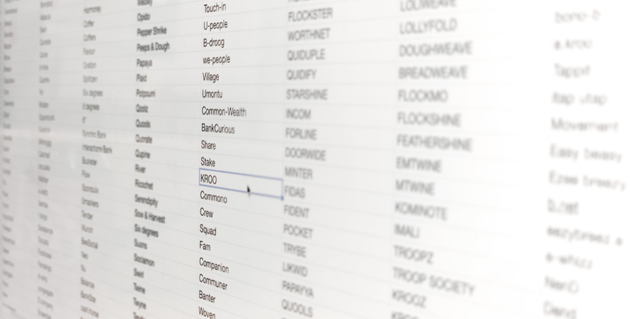
Three months later, a few hundred names and too much coffee, we found a winner.
Why Kroo? Firstly it’s based on the word crew, a team or group of likeminded people working together towards a common goal. We felt that this not only reflected our product and how customers would interact with it but also who we were as a team. Secondly, the name was short and simple to remember yet still quirky enough to raise some eyebrows. And finally, the .com was available — a miracle indeed!
After quickly trademarking Kroo, we moved fast to find the right people who could bring the vision and new brand to life. We carried out a short pitch with two external design teams until finally whittling it down to one, Justified Studio — a small creative team that really understood the vision and creative challenge we had set out.
The brief to Justified was to deliver a brand book that carried enough elements of the brand that we could then take onboard internally and expand across all our channels such as the app, website, social media and so on.
Straight off the bat, they were off to a solid start, and after exploring several routes, we were able to quickly hone it down to our preferred creative. We went through a few iterations to ensure our final brand world would convey the qualities of our values and then we were good to go.
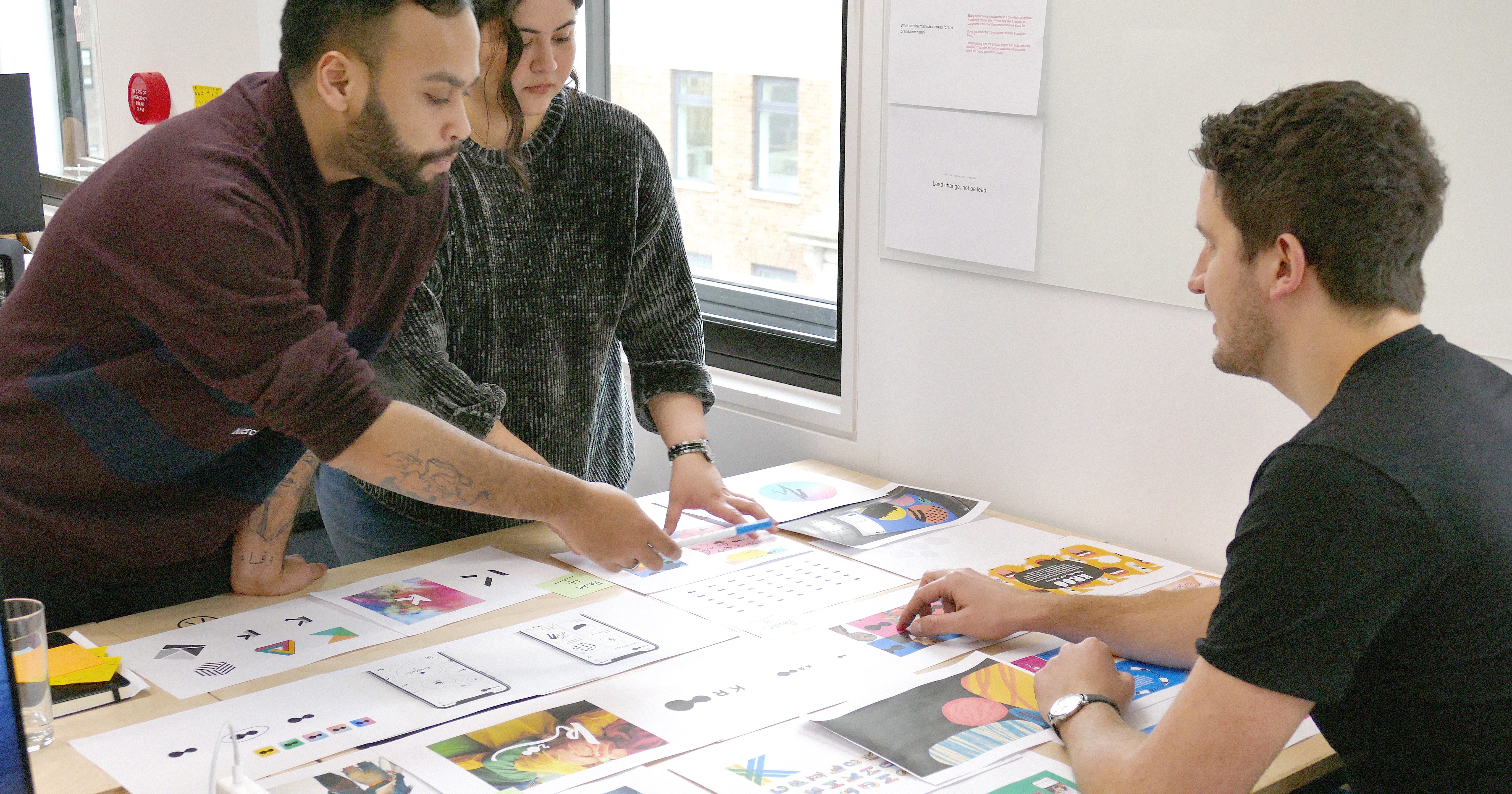
When we internally showcased our new brand for the first time, we knew we were on the right track when we could physically feel the growing excitement amongst the team. Some colour and life were beginning to flourish in the office!


Going from a stark lack of colour to loads of colour certainly throws up its challenges. Breaking each element down we explored all the various touchpoints, working extensively on the lockup, slogan, typography, imagery and colour pallet as we adjusted our mindset from a limited choice to a somewhat overwhelming choice.
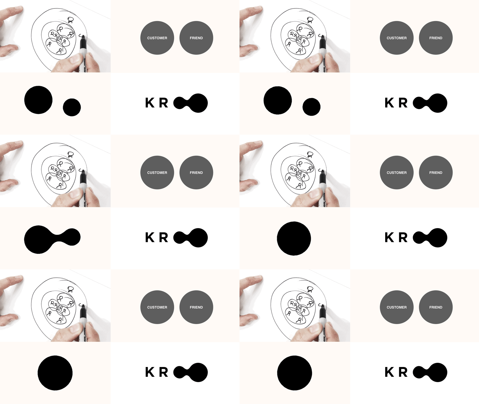
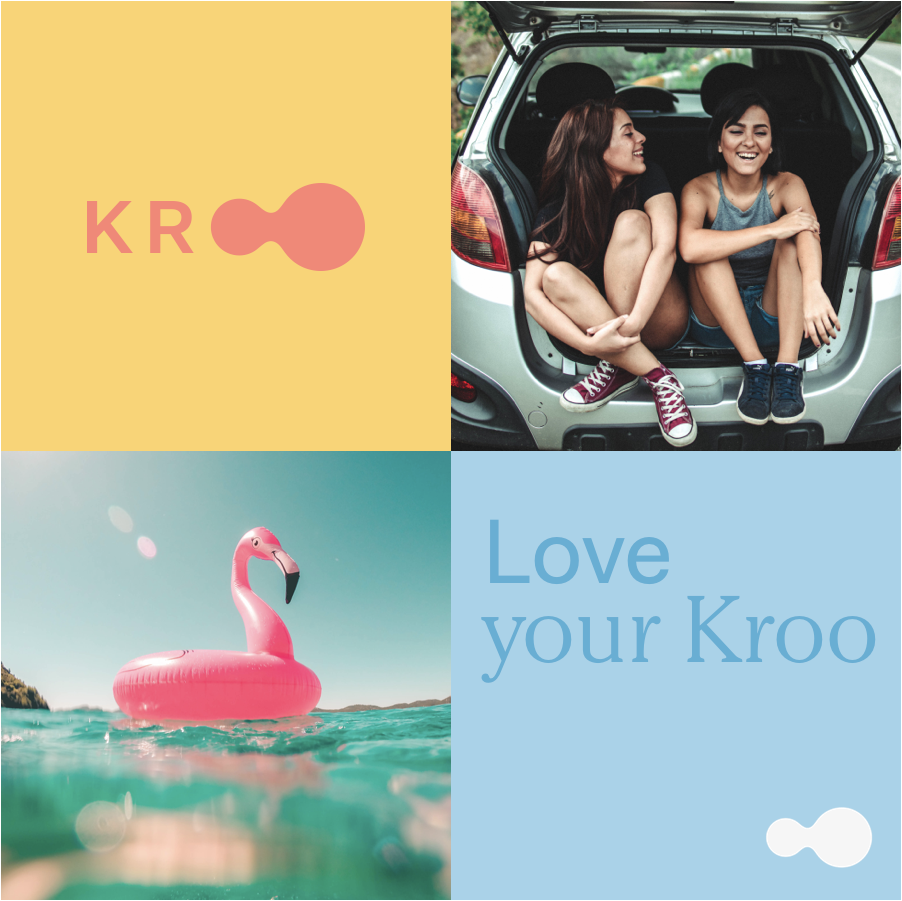
The Kroo lockup is pretty much straight out of the first presentation from Justified. The two oo’s visualising the connectivity and forming a graphic device that has many possibilities.
The result
If we look back at the original challenge set out, we wanted to take a brand that, at the time, resembled an MVP product and bring out a brand that is tangible, full of life and positive energy. Kroo has already been extremely well received by our team, investors and other stakeholders.
It’s interesting how a change of brand can bring so much energy not just to the product but also the team; now it’s time for our customers to enjoy this bright new world too.
What’s next?
Changing not just the brand name, but an entire identity is a massive undertaking for any company, large or small. We see the Kroo brand today as the step in a positive direction; however, we also feel that this is just the beginning. As we continue to grow so will our brand and we have big ambitions for the coming months and years for Kroo to evolve into a brand that people across the UK and the rest of the world will get to know and love just as we do.
Join the Kroo!
If you want to work for Kroo, we are hiring here in London. If you’re a developer, designer or product manager, feel free to reach out to us at careers@kroo.com
